
At the core of digital transformation lies data democratization, the practice of making data accessible throughout all departments of a business, not simply the C-suite and IT team.
Datasets are growing fast. Forget data analytics – business leaders are struggling just to visualize and map out data to begin with. Data visualization works to fix this.
Also see: Top Data Visualization Tools
What is Data Visualization?
Data visualization is the graphical representation of datasets and information. Data visualization is an umbrella term for visualizing all types of data through charts, graphs, and maps.
The ultimate goal is to visually represent your data in an accessible and easy-to-understand manner. Visualizing data is a fundamental step in understanding trends, uncovering patterns, and tracking outliers.
Experts predict that the data visualization market will expand greatly within the next five years, with compound annual growth rates of over 10%, growing to a $19.2 billion market valuation by 2027. Although the rise of data democratization and digital transformation are causes of this rise, much of this growth is due to growing interest in business intelligence.
What are the Benefits of Data Visualization?
There are three key benefits to data visualization:
1. Making Big Data Digestible
There is no question that datasets are growing tenfold. Combine this with the growing advancement of IT systems that are increasingly more advanced, and you have a colossal pain point for businesses.
The fact that data is becoming so overwhelming for organizations has spurred the rise of AIOps. AIOps helps businesses with various use cases such as:
- Predictive alerting
- Root cause analysis
- Prioritizing events
- Predictive outages
- Service desk ticketing
How does this relate to data visualization? Data visualization tools are an effective way to map out data in an automated manner – and this automation is core to AIOps. This hands-off approach makes approaching large datasets rather easy to gather, and then in turn to digest using data visualization techniques.
2. Greater Accessibility
We mentioned how large datasets are now accessible for a greater number of users. This demonstrates that data visualization is a key factor in data democratization.
Data visualization tools help simplify complex robust data points and present them in highly digestible ways. This growing accessibility can help upskill employees and make businesses more efficient.
3. Greater Efficiency & Understanding
Traditional means of sifting through data were meticulous and time-consuming. Data visualization helps businesses discover insights at a much faster rate than prior to the advent of visualization tools.
Speed is central here. This growing scalability means that business leaders have more room to be granular in their analysis. If data is mapped out more quickly, IT teams and data scientists have more time to draw more complex insights from their well-organized databases.
Prior to data democratization, gaps in communication were all too common for enterprises and businesses alike. Boiling down and explaining advanced insights can be difficult without a common understanding of what the datasets behind these insights mean. With modern data visualization software, such as Tableau and Microsoft Power BI, data analysis is broadened to virtually any department within your organization.
Also see: Best Business Intelligence Tools
What are the Different Types of Data Visualization?
Here are examples of various forms of data visualization and uses cases:
Bar graphs: These types of graphs are best utilized to compare aspects of different groups or to track those aspects over time. Bar graphs are best used when changes are rather large.
Line graphs: One of the most popular and fundamental forms of data visualization are line graphs, which are used to track changes over short and long periods of time. Line graphs are particularly useful to highlight smaller changes.

Graphs are, for the most part, are rather modular. Above is an example of a line graph tracking bounce rates; this is in contrast to a bar graph that represents page load times.
Pie Charts: Another fundamental form of data visualization, pie charts are effective for comparing parts of a whole. Because they are not placed on an X-Y plot, tracking data over time is not possible with a pie chart.

These charts are very basic examples of data visualization. Many modern tools are designed to open up complex methods to the everyday user. For instance, here’s one way a management trainee in the finance industry used data visualization software for their needs:
“Power BI is a widely used software in our organization where we deal with a huge amount of raw data and process it to gather actionable insights. It helps us to visualize scattered and unfiltered information efficiently and easy to understand manner…Overall, I would say that this is a must-have software for any enterprise that directly witnesses a lot of data being gathered to formulate strategies and plan of actions” – Management Trainee in finance industry, review of Microsoft Power BI at Gartner Peer Insights.
Scatter Plots: A slightly more advanced data visualization method is scatter plotting. Scatter plots are an effective way to explore the relationship between two variables and multiple sets of data. Below is an example of a scatter plot mapping out profitability in various American cities. Note how cities with larger profitability have larger circles.
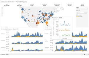
As you can see above, data visualization tools can map out different graphs on the same page to help present holistic insights more clearly. Advanced software solutions will let users build interactive graphs that help stakeholders understand insights even more deeply.
Also see: Top Data Mining Techniques
Data Visualization Best Practices
Keep in mind that the main goal behind data visualization is to present data in a more interesting, relevant, and accessible manner to diverse audiences. Each best practice is specifically designed ultimately for this outcome.
Best practices include:
Choose the Optimal Chart and Graph: Make sure to consider your needs before selecting the proper way to visualize your data. Ponder whether you want to track data over time or how many variables you intend on analyzing. These questions can help your decision making process.
Use Templates: Many data visualization tools offer templates that businesses can “plug and play” with. You want your data to be interesting, but don’t stray away too much from the norm. Templates are an effective way to get a jumpstart on well-presented data and information. Don’t overthink it.
Leverage Color: Color is a subtle, yet highly effective way to map data. For example: you could choose to make an anomalous point in your dataset red to immediately differentiate it from other points. For instance, use red to indicate heat and blue to indicate cold, if you’re tracking weather.
Don’t Distort Data: If users go too overboard with their designs and data visualization charts, they could end up inadvertently distorting insights. For example, pie charts should always be 2D. 3D pie charts might look more interesting and even draw more attention, but the unfortunate result makes each proportion of the chart harder to decipher. An effective pie chart, or any graph for that matter, shouldn’t be a puzzle.
Also see: Top Data Analytics Tools